
Welcome to RateHub, a responsive website designed to streamline currency exchange and provide real-time updates on money transfer services. This project aims to offer users a seamless experience when converting currencies by delivering up-to-the-minute exchange rates and presenting a comprehensive list of money transfer providers. With RateHub, users can effortlessly compare transaction values, ensuring they make informed decisions on the best transfer options available.
RateHub
Case Study
RateHub Video Mockup
Project overview
The Product:
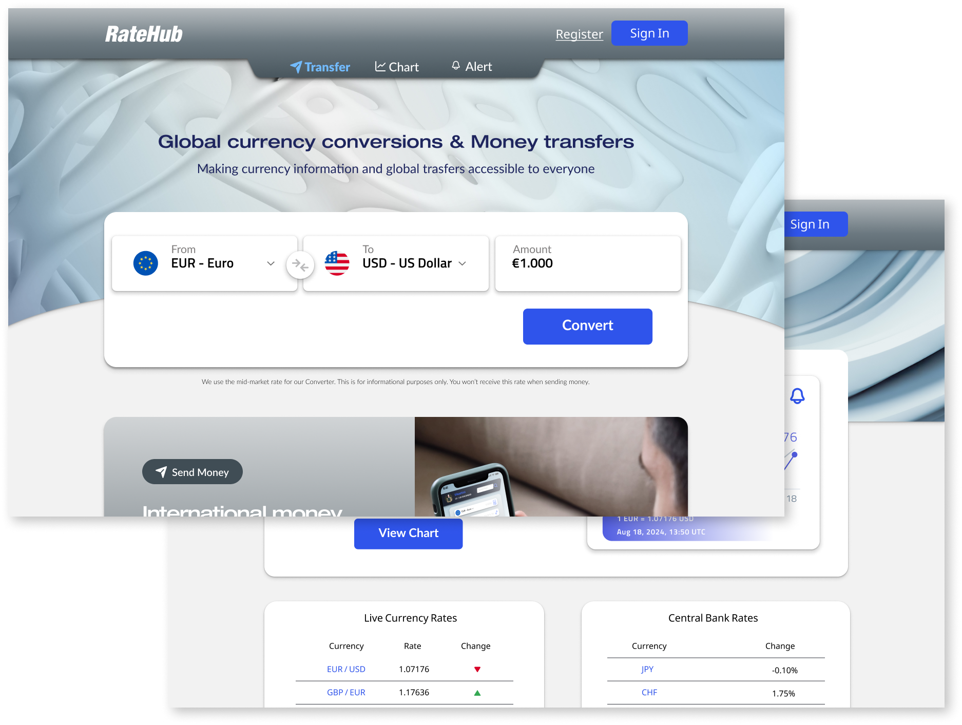
RateHub is a responsive, user-centered website that simplifies finding the best money transfer providers. It offers real-time comparisons of rates and fees, ensuring users get the best value. Designed to ease the financial decisions of millions daily, RateHub is a crucial tool for maximizing savings on transfers.
Project duration:
April 2024 to June 2024
UI Redesign in February 2025
The problem:
The problem RateHub solves is that there are numerous online money transfer providers, and the best rates and fees can change every minute. This makes it challenging for users to find the best value without constant monitoring.
The goal:
The goal of RateHub is to be user-friendly and intuitive, simplifying the money transfer process. By providing real-time comparisons, it helps users effortlessly find the best rates and fees.
My role:
UX Designer leading the RateHub website design.
Responsibilities:
Conducting Interviews, paper and digital wireframing, low and high fidelitity prototyping, conducting usability studies, accounting for accessibility, iterating on designs and responsive designs.
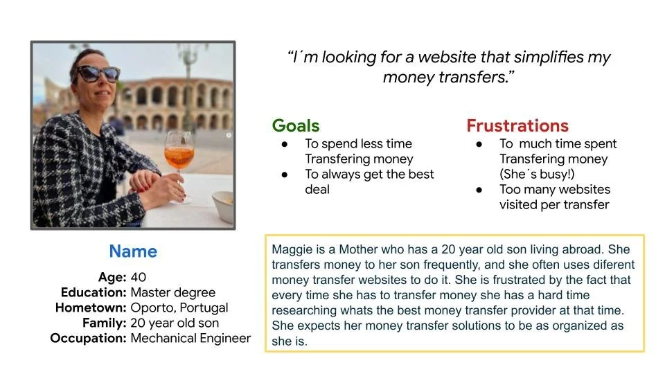
Persona: Maggie
Problem statement:
Maggie is a 40 year old mother who needs frequently to send money to her son because he is living abroad.
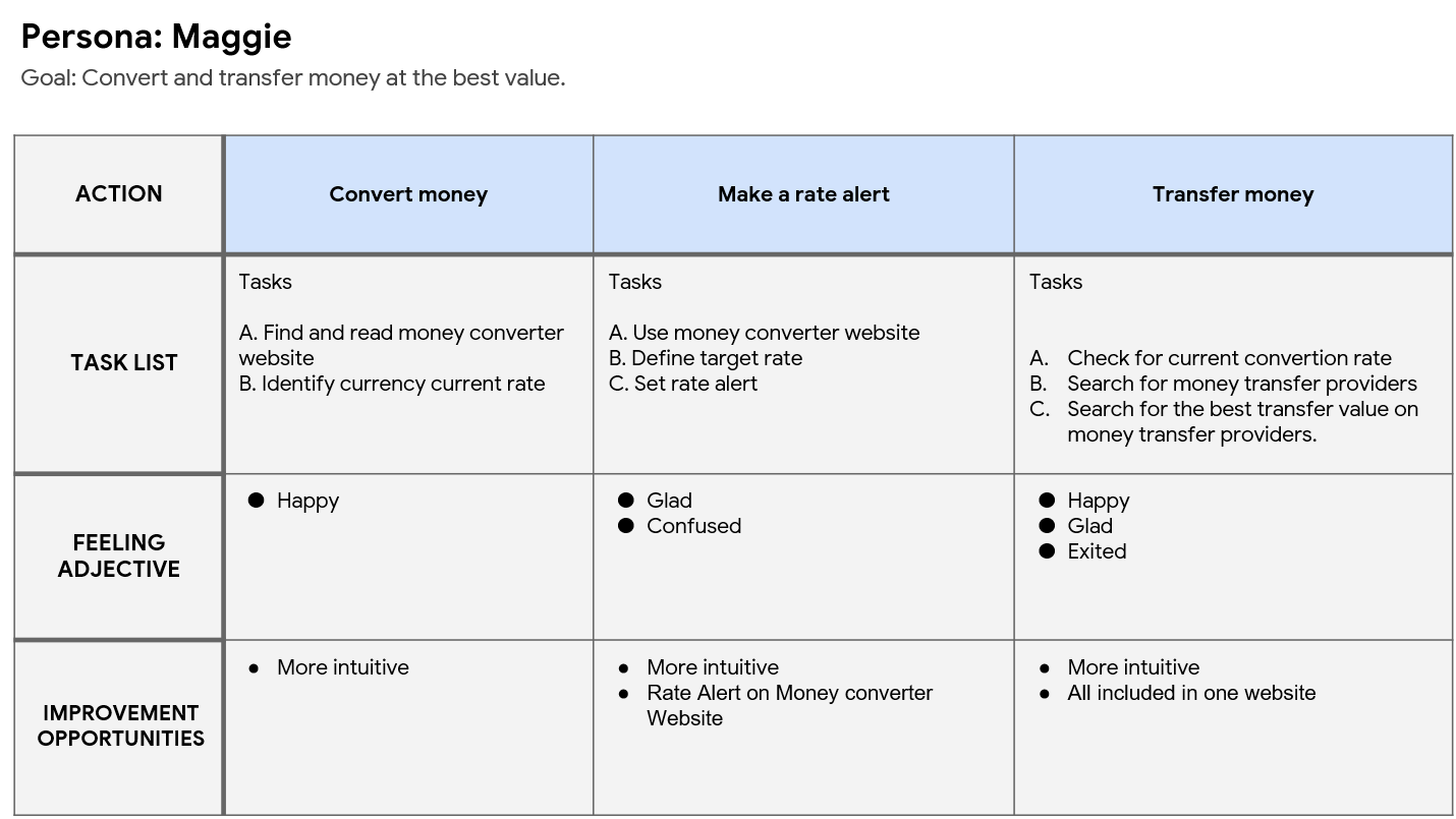
User journey map:
I created a user journey map of Maggie´s experience using the site to help identify possible pain points and improvement opportunities.
Understanding
the user
User research: summary
User interviews and secondary research revealed a strong need for RateHub, a website offering real-time money conversion and optimal transfer rates. Users expressed frustration with the inconsistent rates and hidden fees of existing money transfer services. The abundance of these platforms complicates the process of finding the best deal, often leading to unnecessary financial losses. RateHub aims to solve this problem by providing a user-friendly, responsive interface that transparently displays the best available rates in real time. This feature enables users to easily compare and choose the most cost-effective options for their money transfers, enhancing their overall financial satisfaction.
User research: pain points
Inconsistent Rates and Hidden Fees:
Many users expressed frustration with the inconsistent rates and hidden fees of various money transfer services. They felt misled by advertised rates and often encountered unexpected charges during transactions.
Difficulty in Comparing Services:
Users found it challenging and time-consuming to compare multiple money transfer platforms. The lack of transparency and the manual effort required to check rates and fees were major pain points.
Demand for Real-Time Information:
There was a strong demand for a platform that could provide real-time information on the best transfer rates and fees, enabling users to make quick and informed decisions.
Starting the
design
Sitemap
My goal here was to make strategic and simple information architecture decisions that would improve overall website navigation. The structure I chose was designed to make things simple and easy.
Paper wireframes
I sketched out paper wireframes for each screen in my app, keeping the user pain points in mind.The home screen paper wireframe variations to the right focus on optimizing the money transfer experience for users.
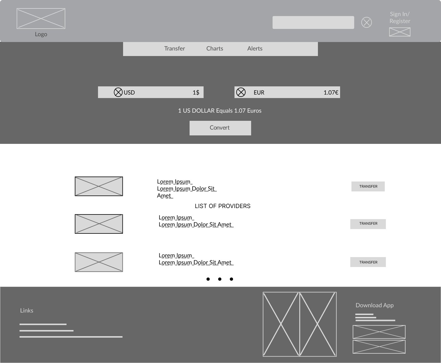
Digital wireframes
Moving from paper to digital wireframes made it easy to understand how the redesign could help address user pain points and improve the user experience.
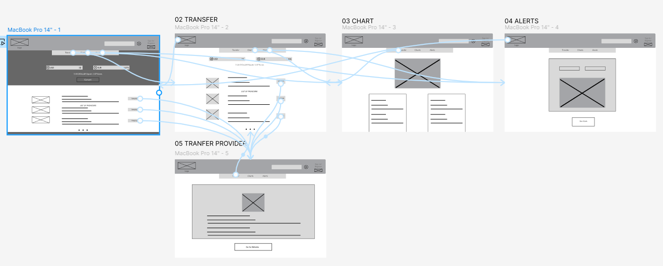
Low-fidelity prototype
To create a low-fidelity prototype, I connected all of the screens involved in the primary user flow. At this point, I had received feedback on my designs from members of my team about things like placement of buttons and page organization. I made sure to listen to their feedback, and I implemented several suggestions in places that addressed user pain points.
Refining the
design
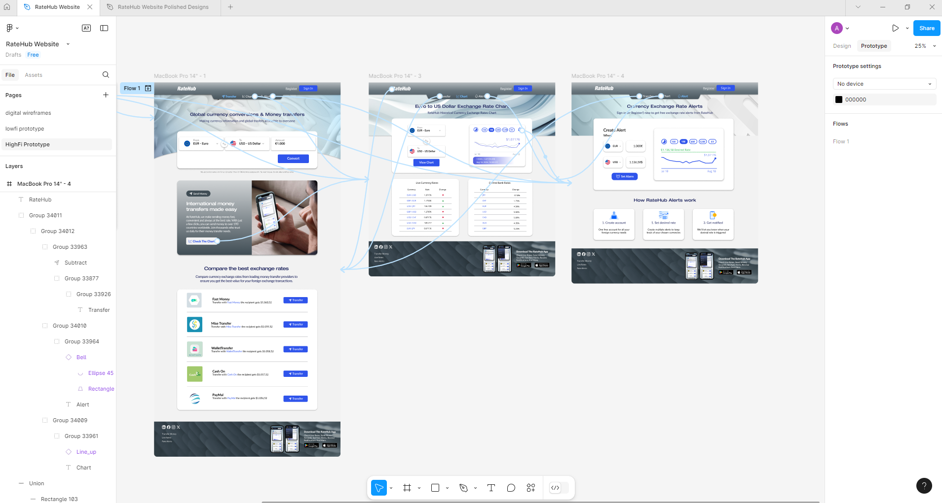
High-fidelity prototype
My hi-fi prototype followed the same user flow as the lo-fi prototype, and included the design changes made after the usability study, as well as several changes suggested by members of my team.
Accessibility considerations
I used headings with different sized text for clear visual hierarchy
I used landmarks to help users navigate the site, including users who rely on assistive technologies
I used sufficient color contrast between text and background to ensure readability for users with visual impairments, including color blindness.
Takeaways
Impact:
A cleanly designed website that converts currencies and shows real-time best transfer rates enhances user experience and trust. It enables quick, informed decisions, ensuring cost-effective transfers. The intuitive layout makes it accessible for all users, fostering loyalty and positioning the site as a reliable money transfer resource.
What I learned:
I've learned the importance of a clean, intuitive design for user engagement. Integrating real-time data is crucial for accuracy and trust. Accessibility features ensure inclusivity. Balancing functionality with simplicity enhances user experience, making financial decisions quicker and more efficient.
